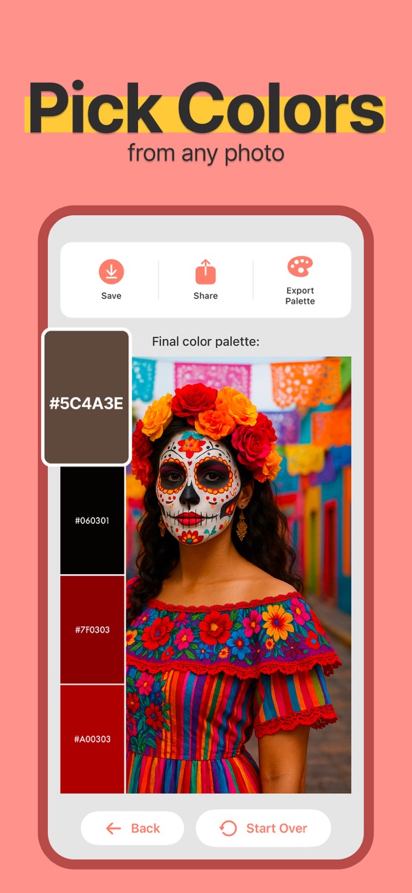
How to create a useful color palette from a photo
Turn a reference photo into a practical palette: choose a main color, supporting neutrals and an accent, then save or export the result.
Quick answer
Extract colors from one clear reference image, then give each selected color a role. A compact palette with a main color, a neutral and an accent is easier to use than an unfiltered collection of every color in the picture.
Step by step
Choose the image for the project
For a room, use a photograph of the materials that will remain. For a visual identity, choose an image whose mood fits the project. Avoid mixing unrelated references before you have a first palette to evaluate.
Extract the colors in Color Viewfinder
Open the image or take a camera snapshot, then review the generated palette. Compare the available layouts and identify colors that represent the subject rather than a glare spot or deep shadow.
Assign a role to each color
Choose a main color for large areas, a neutral background and a smaller accent. Keep a darker or lighter option for text and boundaries. Test these roles in a sample layout instead of relying only on swatches.
Save and export for the next tool
Save the palette for later, copy individual codes, or export Adobe ASE, JSON, CSS or CSV according to the tool receiving it. Open the exported file or paste the codes and confirm the colors arrived as expected.
Example: using a seaside photo
A seaside image might suggest sand for a background, deep blue for headings and a small coral accent for a button. This is a composition example: extract the actual codes from your own image and check text contrast in the finished design.
Before you use the result
A palette is a starting point, not an accessibility test or a physical material specification. For interiors and print, compare real samples under the intended lighting before ordering.